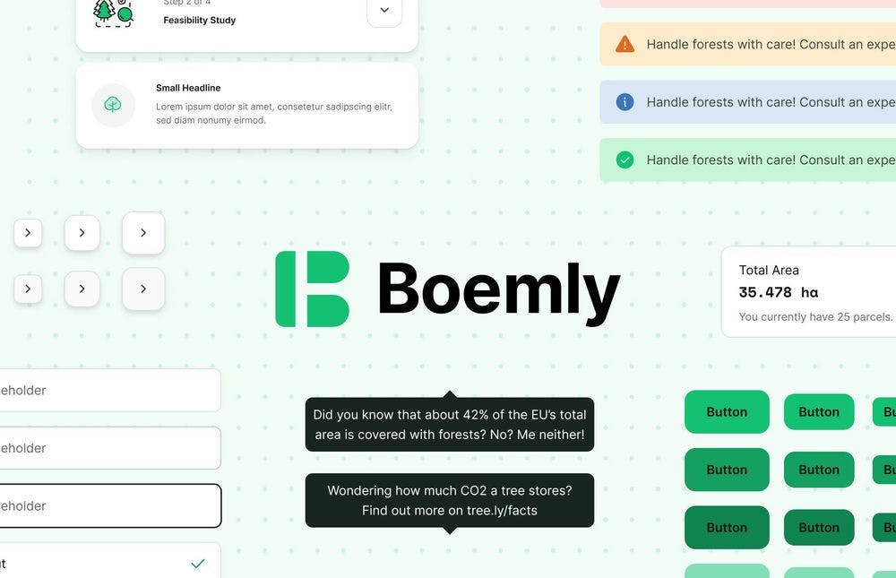
I’m very happy to introduce our brand new component library for React - Boemly. Boemly is based on the widely known open-source component library ChakraUI, which is focused on accessibility and speed. Boemly focuses on the same values and enriches ChakraUI with some neat components conceptualised and built by the Tree.ly team. Boemly offers a very limited amount of customizations to keep it simple, only core tokens like fonts, colours, border radii, … can be customised.
How to use Boemly?
Boemly tries to be as easy to use as possible. It’s based on the widely known provider pattern in React. You have to wrap the whole app in the BoemlyThemeProvider and then use the components of the library. A little example:
import { Button, BoemlyThemeProvider } from 'boemly'; function App() { return ( <BoemlyThemeProvider> <Button>Button</Button> </BoemlyThemeProvider> ); } export default App;
Useful links:
-
Full documentation → https://boemly.tree.ly
-
GitHub → https://github.com/treely/boemly (Don’t forget to star!)
-
Technical details
Boemly is 100 % written in Typescript and follows the high coding standards at Tree.ly. Same as ChakraUI, Boemly uses Emotion for styling and Framer Motion for smooth animations. To ensure code quality an automated linting, testing, and publishing pipeline is set up. Deploy early, fail fast!
Open source
Boemly is an open-source project and has already found some contributors. We at Tree.ly believe in the valuability of an engaged developer community. That’s why we want to open-source as much as possible and encourage employees to contribute to open-source projects whenever they want. Boemly is the first open-source project of our young company - contributions are highly appreciated - don’t be afraid of being wrong.


